New logo GMS Instruments 50 year anniversary
Today is the day we proudly launch our new logo. Celebrating GMS Instruments’ 50th anniversary and saying goodbye to our old logo which grew with us for the past 49 years. Read the full story of GMS Instruments here.
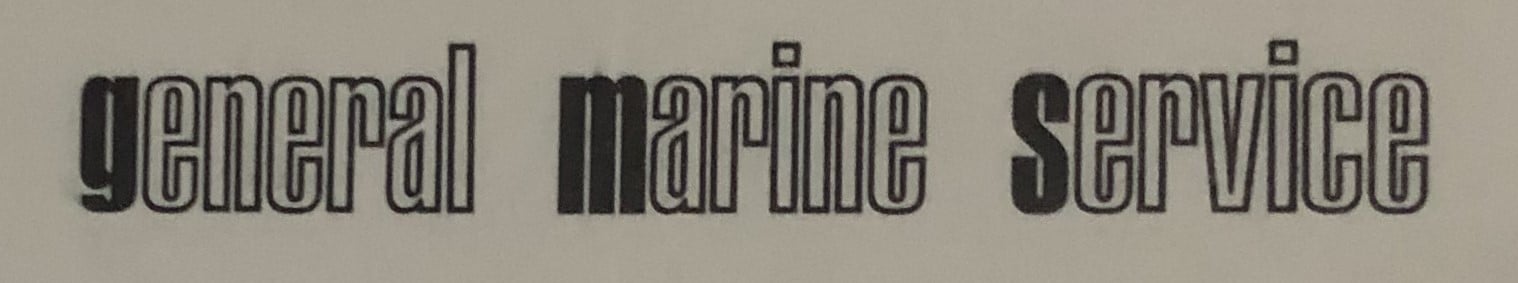
Since the start, the GMS logo consisted of the letters that form our company name. Started as General Marine Service, we’ve grown into a broader and more diverse market than just the maritime sector. This resulted in us shortening our name, making it capable of penetrating different markets and reaching other customers.
Today marks the beginning of a new step. Over the years, GMS Instruments grew both as a company and organisation. Which brought us an international distributor network, both global and local clients, and a great team of specialists. All who formed our company. But with this happening, our old logo did not math this growth. With our new logo, we’re seeking for recognizability, trust, international allure and legacy.
All this we find in the letter G of GMS Instruments. Based on the concept of a pressure gauge, our oldest selling product. A case is formed in the G’s outer lines while the red stripe is indicating its pointer. It’s simple but still intuitive, both internationally and locally recognizable and new but keeping it old school. We thank FIVE TWENTY for their creative input.
We proudly present you the marking of 50 years of GMS Instruments.
Related
More of the same